Photography Checklists - A simple option to make you a better photographer

We are proud to introduce a simple product designed to make photographers of all skill levels better.  Based on the aviation pocket checklist Hal flew with on every mission, we created Hal Schmitt's Digital Photography Pocket Checklist, or Photo PCL for short.

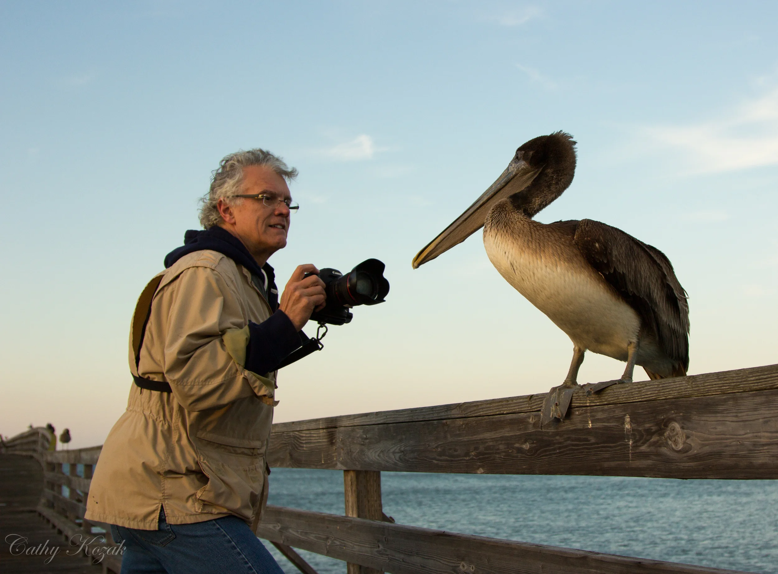
With digital, we find very few photographers that specialize in only one subject or use only one technique.  That is one of the awesome parts of digital but the hard part is remembering every different technique and all of the critical steps necessary to make the shot.  On any given day or maybe even during any given shoot a photographer may need to use flash, studio strobe, HDR, panorama, focus stacking, neutral density filters, action, and other techniques.  For most shooters, it is a challenge to remember every technique and even more challenging when the shot needs to happen quickly.  This is where the pocket checklist comes in to assist with all of the different techniques.  For reference, the Photo PCL table of contents is shown below.

toc.jpg

The modern, operational checklist is based on the early aviation checklists created in the 1930s.  Since then, the aviation community in particular has come to rely on the checklist as the best way to ensure pilots do not forget the critical steps of a procedure, especially when something goes wrong.  The checklist is not designed to teach you a full procedure but instead should remind you of what you already know.  That is why we were able to fit this many checklists into one small publication as each is only one page of the most important steps.  Hal became incredibly familiar with and relied heavily on operational checklists when flying the FA-18.  The pocket checklist or PCL did not contain every part of a procedure but instead only the most important items.  This was critical as the PCL had to fit in the relatively small cockpit and be user friendly in an operational setting.   The aviation PCL is shown below.

FA-18 pocket checklist

FA-18 pocket checklist

Today many other disciplines have turned to the checklist as a means of increasing performance and reducing human error.  The best part is there is an almost immediate return on a very small investment.  Whether doctors, nurses, pilots, or energy industry workers, checklists have become an essential cross check to boost performance.   

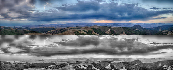
The checklists in Hal's Photo PCL are derived from long-form photography procedures compiled from shooting with many instructors and thousands of clients.  We put together what we call the photography "best practices" and then shortened to the critical steps.  For example, the checklist describing shooting a hand-held high dynamic range series is shown below.

Capture.PNG

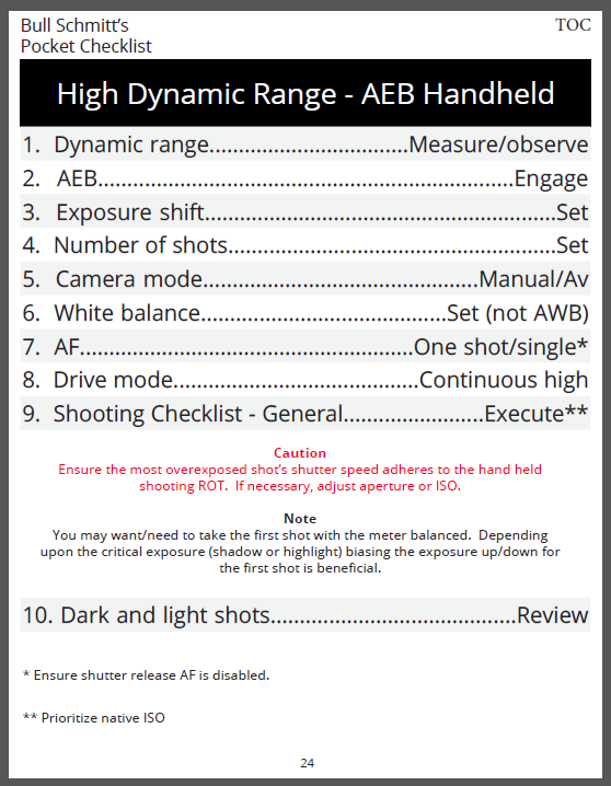
The checklist is laid out in a simple to follow format and contains steps as well as warnings, cautions, and notes that help to remember the procedure and all necessary information.  This format is very similar to that used by carrier pilots in an operational setting.   

Often when checklists are introduced to a new discipline, the reaction is that a standardized, box-checking process will never work.  To quote from the Photo PCL introduction, "People often reject standardization as they believe it creates an army of robots all doing exactly the same thing and removes personal though and choice.  In photographic practice, nothing could be farther from the truth.  Technical standardization does not free you from thinking but instead frees you to think and concentrate on the creative and artistic side of your photography."

As Hal often speaks of, flying fighters is one of the most dynamic operations in the world.  It is precisely because of standardization, procedures, and checklists that our pilots are able to work and excel in such an environment.   As we have noted over the last six months of testing these procedures and checklists with our clients at LIGHT, photographers who use the checklists also excel and make better images in a more consistent and repeatable manner.

The Photo PCL is a simple, interactive PDF that may be printed or used electronically.  Our testers have printed the PCL on 5 x 7 cards and taken to them to the field or have referenced on iBooks or with a  PDF viewer.  To download the PCL, visit the link below.


Topaz Labs ReStyle - Quick Look

Take a look at the new plug in from Topaz Labs called ReStyle.  Hal demonstrates and discusses the plug in this quick video.  Restyle offers one click access to create stylized interpretation of your original image.  You can easily make dozens or hundreds of variations when using the 1000+ presets available in ReStyle. 

The presets are awesome; single click mapping of tones and colors to create unique images, but what makes ReStyle even cooler are the additional controls.  Once you apply a preset you can modify the settings, mask the effects, and even change Blend Modes!Blend Modes are one of my favorite features in Photoshop and it is great to have them available in ReStyle.

ReStyle will retail for 59.99 but the price is 29.99 until the 31st of August with the discount code "restyleit ".

Click the link below to check it out.   


Interesting New Plugin - ReStyle

Started playing with a soon-to-be-released plugin from Topaz Labs yesterday.  I will do a more detailed video on this software soon but in the meantime here is a six pack of the same image to show some of the effects.  All five variants of the original photo are made with a single click in Topaz ReStyle.  The plugin contains about 1000 presets to choose from.  The hardest thing so far has been looking through everything! 

Topaz Restyle generated variants of an Alaskan sunset rainbow. 

Topaz Restyle generated variants of an Alaskan sunset rainbow. 

Hal's Videos and all Elephorm Content Streaming Free

Elephorm, the company that hosts Hal's Lightroom videos, transitioned to a "freemium" model today.  That means all content streams free all the time.  If you prefer to download to your local machine or device there is a small fee.  Pretty cool.  Incredible training at a great price.

Hal's current content on Elephorm is Lightroom 4. With that said, about 98% of the content is directly applicable to Lightroom 5.  His new material will be up soonest. 

Fiat Lux! 

Building a Printer Profile Video Demonstration

Hal recently recorded the process to build your own printer profile using an X-Rite Color Munki.  There are many choices out there but as Hal describes, the Munki delivers pretty good "bang for the buck."

If you prefer to read the process, click on the following link to Hal's description over on the Alpha Strike blog. 

Schedule Launched for Click4! California Photo Fest!

We are proud to announce the California Photo Festival Click4! website is now live and ready for action!

This year we invited a few new names to add to our already awesome list of top photography pros. Stay tuned to ourFacebook page and Blog for updates, tips, tricks, and information on classes you might find interesting!

Remember to use the Early Bird discount if you register before August 7th.  Enter "EB2013" and save $50 off of your Gold Week Pass.

Another great option is to bring a friend and use the 1 + 1 pass.  This saves each participant $100!

For Military and Student offers please contact the office and read our terms on the website.

You can also find more pricing information on our registration page.

Looking forward to seeing you, learning, and making great images this fall. - Hal & Victoria

How to Use a Coupon Code to Save you Money This Year!
 

Here's what you do:
Register for the Gold Week Photo Festival Pass
Enter this code into the discount area of your shopping cart   EB2013  and make sure your press "apply".
Once you see your discount applied continue on to finish registration by logging in and making your schedule!
If you already have an account from the last year just login with your email and password and finish the registration for Click4!
If you are new, welcome! Just create your account, accept the terms and conditions (after you've read them of course) and finish your registration.
Source: http://www.californiaphotofest.com/

Guest Blog! 5 Food Photography Tips

by Kent Cameron

Food photography has never been more popular. The interest in food and sharing food experiences have been driven by digital cameras, food blogging, Facebook, Pinterest, e-books, cookbook self-publishing and media like Food Network, which have all helped to fuel the food trend.

Following that trend, several years ago my wife, Sally, a professional chef, decided to create a food blog called, A Food Centric Life. She asked if I could use my photography skills to take some shots of her food. I quickly learned that creating great looking food images has its own special set of challenges.

Whether you are a photographer wanting to add food to your portfolio, a cookbook author, a blogger, or anyone interested in shooting food, here are a few tips from my food photography journey that may be helpful in your journey…

Tell a Story

When we prepare for a food shoot, we talk about the story first. The story may be about enjoying some crème brulee and espresso at a bistro in Paris, or grilling burgers in the park for a picnic on a rustic table, or something very simple.​

Ask yourself what the food or recipe means to you? Does it have meaning in your life? What is the setting? Is it a holiday, a seasonal dish, a fami­­­­ly favorite? What props, colors and textures are involved? How will you tell that story to the viewer with your image?

Direct the Light

Look for light that has direction. It can be light through a window, or doorway. We often shoot food in our garage with the open garage door creating a large space with directional light. Or, we create directional light using studio lights when natural light is not available.

Set up the shot so that the light is coming from behind or from the side. Think about light direction like the hands on a clock. If the food is at 6:00, backlight is 12:00, and side light is 9:00 or 3:00. Lighting this way creates depth and interest in the food. Never light food directly from the front, and absolutely do not shoot food with a flash mounted on your camera.

Diffuse and Reflect

A common mistake is to over light food images. Once you have created a scene with directional light, then can decide how much highlight and shadow works for the shot. Use a diffuser to soften the light and control highlights. Not all food images use soft light, but it works great for many.

Use a reflector to control the amount of shadow. We use pieces of basic foam core board that you can buy at any art supply stores as a reflector. Position the foam core opposite the light. Use white foam core to reflect light and brighten the shadows, and black foam core to take light away, creating deeper shadows. It's amazing what you can do with your food images by just experimenting with reflectors.

Work the Composition

Amazingly subtle changes in your composition can make or break your image, so really work your shot angles, direction of the light, placement of the food and props in the shot. Use the composition rule of thirds and avoid placing food dead center in the frame.

Style the Food

The job of a food stylist is to make the food look its best for the camera and create direction or flow of movement for the eye. Unless you are working a well budgeted food shoot, likely the food stylist is you! I am fortunate that my wife, Sally, is a chef so preparing and styling the food is her department. 

Buy top quality food and ingredients. You want beautiful food for beautiful food photos. When styling, think how you can create movement in the image. Add a flowing napkin with complementary color, for example, or maybe a utensil. Think about how you can add textures and create lines that draw the viewer's eye into the food scene.

Learn More about Food Photography

Kent and Sally Cameron work as a team, blending their love for great food, photography, and teaching to produce beautiful images that inspire and educate people about food.

Orange Ginger Creme Brulee.jpg
Turkey Burgers.jpg
Roasted Ratatouille.jpg

Rick Sammon: Color Efex Pro Tip

I photographed the “Official Parking Man” of Old Havana, Cuba. I like the straight shot, but I wanted to remove some of the reality from the scene, which is another advantage to using plug-ins. When we remove some of the reality from an image, our pictures can look more artistic and creative.

In Nik Software's Color Efex Pro
Filter: Bleach Bypass

Effect: Intensifies an image by creating a greater difference between highlights and shadows. Adds bold tones to an image.

Filter Tip: Experiment with Saturation settings. As with many effects, less is often best, as I found with this image. This effect works well with images that have fine lines.

Photo Tip: Keep in mind that people don’t always need to be looking directly into the camera when you take their portrait.

​And check out Rick's new iPhone/iPad app with 50+ tips on using Nik's Color Efex Pro.

Before

Before

After

After

Rick Sammon's New iPhone/iPad App!

​The amazing Mr. Sammon has just released a new app for the iPhone & iPad that is like an interactive eBook. If you wanted to know how to get the most out of Nik Software's Color Efex Pro, this app is for you. And it's an absolute STEAL at $0.99! Jump over to the app store today and check it out!

More info on the app on Rick's site HERE.
Buy in the App Store.​

Guest Blog! Flower Photos Beyond the Macro Lens

by Rob Sheppard

For Southern California where I live, spring is here and flowers are blooming. California as a whole has a very long spring compared to Minnesota where I grew up. Flowers can be found year round in many areas, plus a true spring in terms of flowers starts at the end of January and doesn’t end until June.

Flowers are such a great subject, too, because they are beautiful and they never run away from you or complain about having their picture taken! We are going to have a great field workshop to explore flower photography this April at LIGHT, and it will also include very practical work in Lightroom and critiques.

One of the first things many photographers think is that they must have a macro lens to do flower photography. While a macro lens can do many good things, it can also be very limiting for flowers because it is just one focal length.

I use focal lengths from 10mm fisheye to 400mm telephoto for flowers (I shoot APS-C format; for 35mm-full-frame, equivalent focal lengths would be 15mm fisheye to 600mm telephoto; for Four Thirds, this would be 8mm fisheye to 300mm telephoto). With the two California poppy photos seen here, I used a 10mm fisheye and a 200mm telephoto. With the yellow black-eye susan flowers, I used a 16mm wide-angle, and for the white thistle, a 400mm telephoto. I focus close in three ways: I look for lenses that focus close on their own, I use extension tubes, and I use achromatic close-up lenses.

Extension tubes are just that, empty tubes that extend the lens away from the camera body (you do want the kind that connect the camera electronics to the lens electronics, though). That allows any lens to focus closer. How close you can focus depends on the focal length to extension tube size. Wide-angle lenses need minimal extension to focus very close (usually you will find it difficult to use extension tubes for lenses wider than 24mm), while telephoto lenses need more. You can get a set of Kenko auto extension tubes for almost any camera brand, and I find they work well.

Achromatic close-up lenses are highly corrected close-up lenses that screw onto the front of your lens. Canon’s achromatic close-up lenses are best known – the 500D and 250D. I have a 77mm 500D that is big enough to be used with a wide-angle lens, plus I can use adapter rings to fit it to smaller diameter lenses.

Either extension tubes or achromatic close-up lenses can make all of your lenses act like macro lenses in terms of close-focusing. Results can be quite remarkable, though the quality can only be as good as the original lens. One thing you may find is that some lenses do well up close, and others do less well, and you cannot predict this by the price of the lens.

I love to use telephotos to isolate a flower and make it stand out against a soft, beautiful background. To do that, I will often shoot wide-open for f-stop – don’t be afraid of your wide f-stops such as f/2.8, f/4. f/5.6. Telephotos also compress distance and make a group of flowers tighter and more dense. They can also enlarge a portion of the background to make it work better behind your subject.

I love wide-angles for close-ups because now I can emphasize the environment of the flower. You now get in really close to the subject, and I mean REALLY close. Often I suggest photographers set their wide-angle to its closest focusing distance, with or without an achromatic close-up lens, and then move in until the flowers are in focus to really see the possibilities here. This forces you to get close.

A wide-angle up close makes the background smaller, yet more noticeable. It can be challenging to use because of that, but on the other hand, that is exactly what makes this type of shooting interesting. Depth of field is always greater so even out-of-focus areas are recognizable. Finally, perspective is stretched out so that flowers look like they are spread apart more. That can offer some very interesting opportunities for compositions that stretch back into the distance.

Come see Rob this spring and learn these techniques and more at his Springtime Flowers and Lightroom workshop April 24-28, 2013.​

Rob's free e-book, A Nature Photography Manifesto, is now available for the iPad or as a PDF e-book for any other computer. You can find the iPad interactive version at the iBooks Store. There are also links to both versions at www.robsheppardphoto.com/books.html.

California Photo Festival Photo Contest Winner!

Congratulations, Barbi Kutilek!

Out of the hundreds of awesome photos that came from our Third Annual California Photo Festival we narrowed down our top photos. From that selection we chose one deserving winner who has won a free Gold-Week Pass to our Fourth Annual Festival October 7-11, 2013.

​California Photo Festival Photography Contest Winner Barbi Kutilek www.Imagesbybk.com

​California Photo Festival Photography Contest Winner Barbi Kutilek www.Imagesbybk.com

Here is the gallery link to our TOP 50 California Photo Festival images from 2012 in our SmugMug sponsored Web Gallery. Thank you SmugMug for your continued support! Our past festival photo galleries there as well if you'd like to take a look while you're there!

About the California Photo Festival:​

Also known as CLICK! our annual California Photo Festival was launched in 2010. After years of prep and planning with inspiration from our guest instructors we invite to teach here at LIGHT Photographic Workshops throughout the years we were excited to offer our students and friends in the industry something new and unique.​ Beyond the 5 days of awesome photo-ops and now over 170+ sessions scheduled (in 2012) this is an event that is for those who have a passion for all things photography and enjoy the learning process to create good images. We design our schedule from sunrise to night photography with hands-on shooting sessions, digital workflow seminars and sponsored presentations. With a wide range of topics from landscape black and whites to Playboy style shooting and lighting techniques to horses on the beach at Morro Bay, we allow our attendees to sit in on sessions and classes they wouldn't normally find themselves taking a workshop or class on. It's a way for us to help you grow as a photographer, artist and professional grow and experience the best in the industry and have fun in the meantime!​

​Ric Sammon on his festival Photo Walk

​Ric Sammon on his festival Photo Walk

This year our dates are October 7-11, 2013. We will center the festival at Embassy Suites in San Luis Obispo but our venues include spectacular areas around the Central Coast. With such a wide area of SLO county land to chose from, we are growing and diversifying our venue list every year- while still keeping the classics around.​ We plan to launch our schedule and websiteregistrations Mid-April so keep a look out for the announcements and make sure you register early to get the classes that fill up quickly! Just wait until you see who we have coming this year!

See you in October!​

-The LIGHT Team

Break OUT!

Print Testing and Breaking Out of Your Normal Box
by Victoria Schmitt

A couple of weeks ago LIGHT hosted a printing class featuring Hal Schmitt which I was able to assist. One of my favorite things as an assistant is being able to help people with their images. With small tricks of the trade in Photoshop or just being able to help someone to think outside of their normal processing workflow will sometimes give people that “ah-ha!” moment to go forward with at home.

Here is how I helped our students once they thought their image was “print ready”.

1. Do one more dust spot check. I like to blow the image up to 100%. Choose the spot healing brush tool (yes, there are 20 ways to everything in Photoshop and this is just one of them) and with the hand tool (hold down the space bar) jiggle the image a little bit as you pan across the image on your screen. Some people like to use page and page down- which is fine, just make sure that you are still “jiggling” the image. It helps those inconsistencies jump out to your eye.

2. Pan out to view the entire image on your screen. Does anything jump out to your eye in a negative way? Is there a light or dark area that fights the direction of your eye when you look at the image? Sometimes I find that I need to print out a test print to really see what the image is doing to the “viewer’s eye”. I’ll sometimes look at the center of the image or the area where you want your focus brought to. If your peripheral vision in the image catches a shape, tonal change or area that pulls your focus away from where you want it then work on that toremove the shape” (usually a stick or object that could other wise just not exist), tone down your bright areas or crop out parts closer to the edge that keep the image from appearing complete.

3. Start with a small test print (8.5x11). This shows blatant areas that need attention, global tonal needs, and it also tests you to make sure your print settings are correct.

4. Print the next size up: I go with 13x19 paper size. This usually starts to show you more missed spots, more chromatic aberration color shifts and gives you a better idea of where they eye wants to move.

Something else you should consider about images that might just not feel right to you is trying the image in black and white. I had a student whose style screamed black and white and she had no idea until we tried it out. Her color versions didn’t have much of a pop or wow factor because my eye was trying to process the texture, movement, shape and color. Sometimes the best thing for your images is to simplify. Maybe you took that photo because you liked the texture, the lines, the movement and the subjectbut you start processing color as well and your brain can get confused and wants to move on. Working on those images can make you frustrated!

This is when I will sometimes give myself shooting or processing assignments to release my brain from the usual workflow and give it something new to concentrate on. Go back to the images you have already shot and decided not to process. Ask yourself “why didn’t I process that image?” and go to town with it! Change the hues, crop it down, try it in vertical and horizontal! Go to Lightroom and make a few virtual copies, create 5-6 different versions and see if there is anything about that image that you like. If those 5-6 new versions don’t do it for you- delete it and save your hard drive space!

There is no right or wrong answer when it comes to YOUR work. Experiment to see what you like and see what works and what doesn’t. The next time you go out to shoot, keep those lessons in mind so you know what you’re going to work on later. You will become a more efficient photographer when it matters and more fun when you process.

before_after.jpg

Ben Willmore on CreativeLIVE

Ben Willmore, one of our favorite instructors is on CreativeLive today through Saturday. Stream it live for free or buy the (incredible and totally worth it!!!) videos for $99 by the time the course is finished airing. If you wait buy them they go up to $149. Still a great deal for what you get!

Or come join us in Los Osos and work with Ben in person for his Mastering HDR & Light Painting course in March.